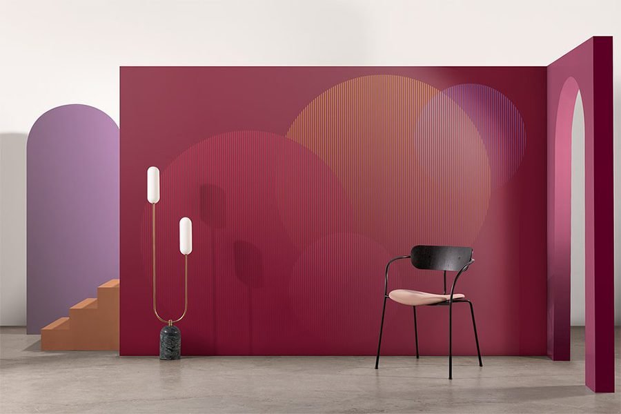
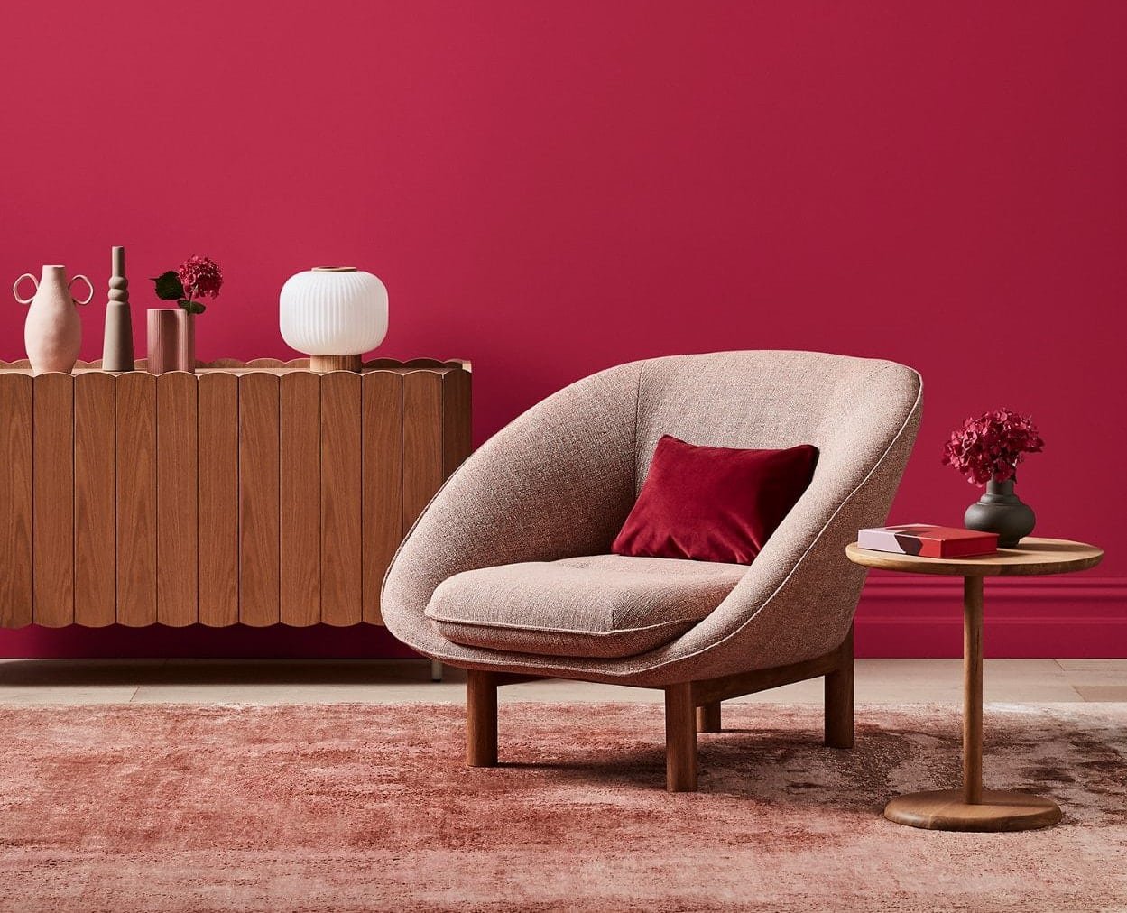
In a designer’s language, colours have the ability to affect a user’s mood, and showcase a reflection of the brand. When it comes to commercial spaces, these factors make colour selection crucial to the overall design. This year’s Pantone Colour of the Year – Viva Magenta, is definitely bold. With reference to interiors, the shade exists at the border of blasphemy and ballsy – too much of it could make a space overpowering, and just the right amount could add that coveted edgy streak.
‘Viva Magenta’ is a powerful and empowering colour – an animated red which leads to making a stand-out-statement amongst the crowd. If you are not certain of the various ways to use this striking “colour of the year”, then here are 6 suggestions to use the Pantone Colour of the Year in commercial interiors, which can create the most unique and dazzling commercial layout for your space.
1. Indulge in a standout Viva Magenta to lift the office space
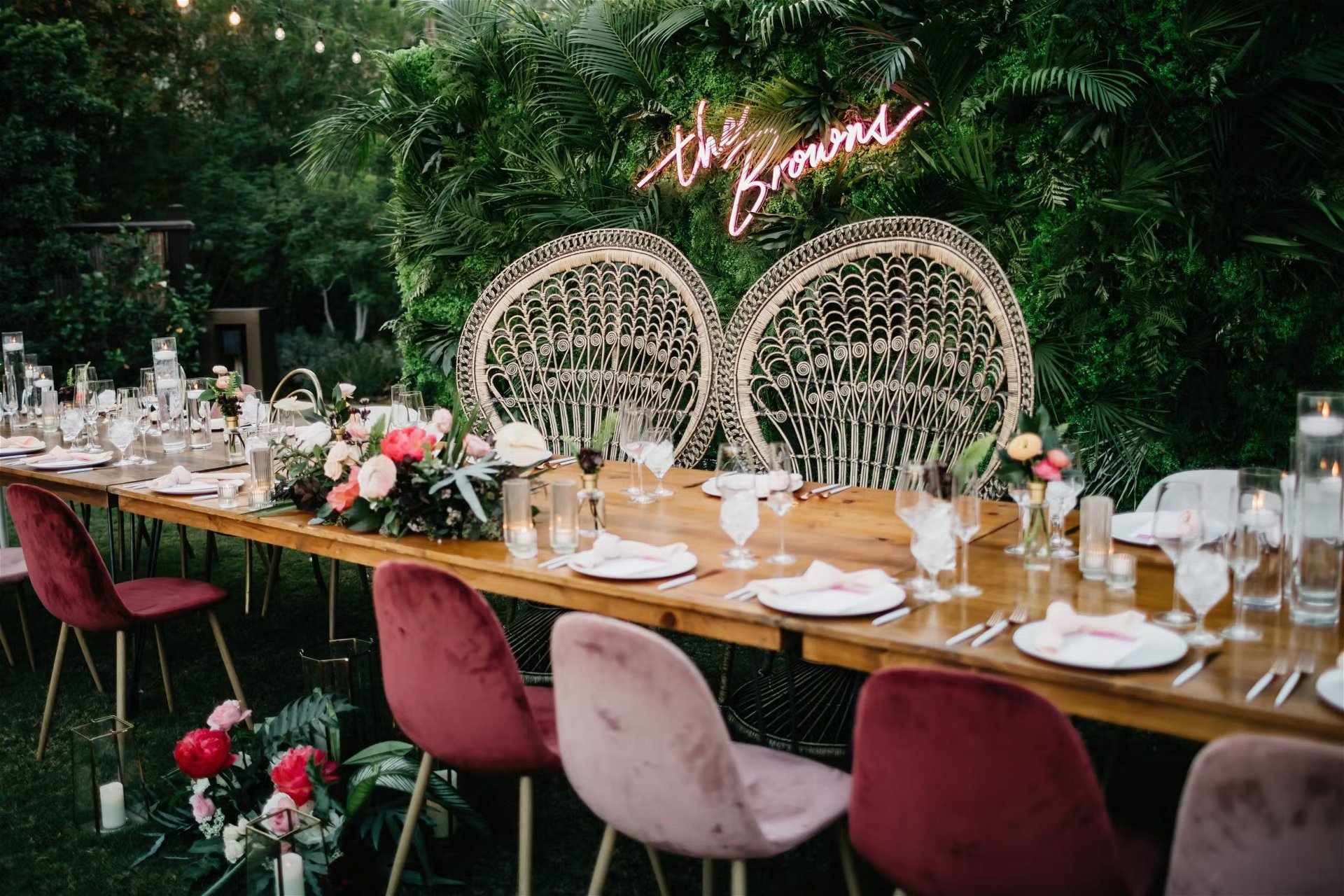
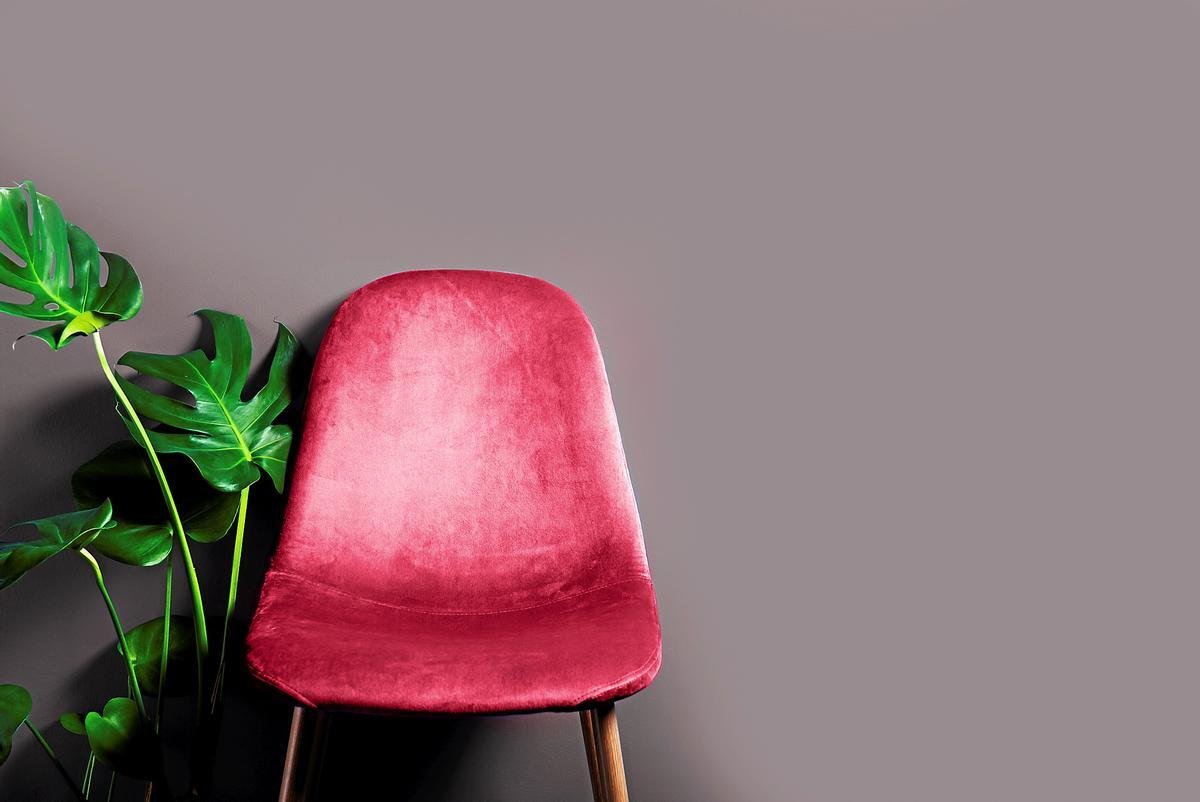
A colour as vibrant as Viva Magenta, can be a sleek spreader within the furniture, countertops and shelves of commercial offices. United with creamy white colours and textures, this specific combination can balance out the entire space in an alluring fashion. Always ensure to overdo it with one tone of colour as it gets uncomfortable for the user’s eye to grasp.
Designers can even pair up the same tones of magenta on the carpets of the meeting rooms. Remember to keep the furniture neutral and the backdrop dipping in mauve tones of red, creating a perfect backdrop for meetings.
With both commercial and home offices, these spaces, one can also indulge in the signature colour-blocking style. The designer can incorporate white furniture fittings and soft wall colours in contrast to these statement walls for design stability.
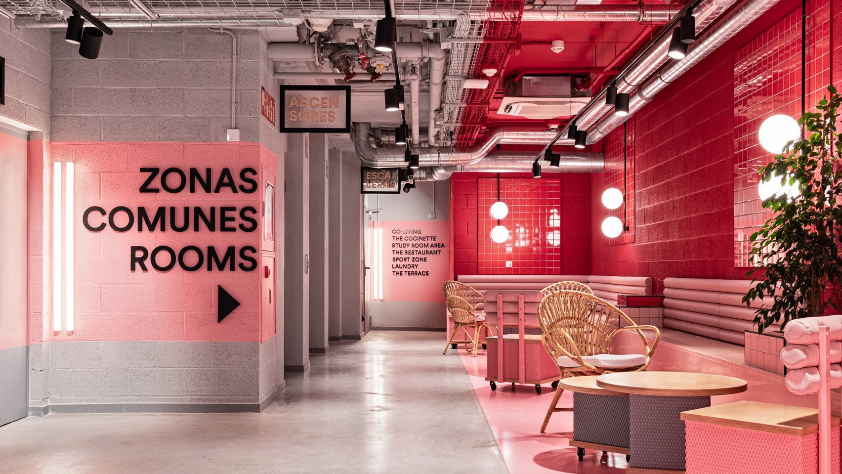
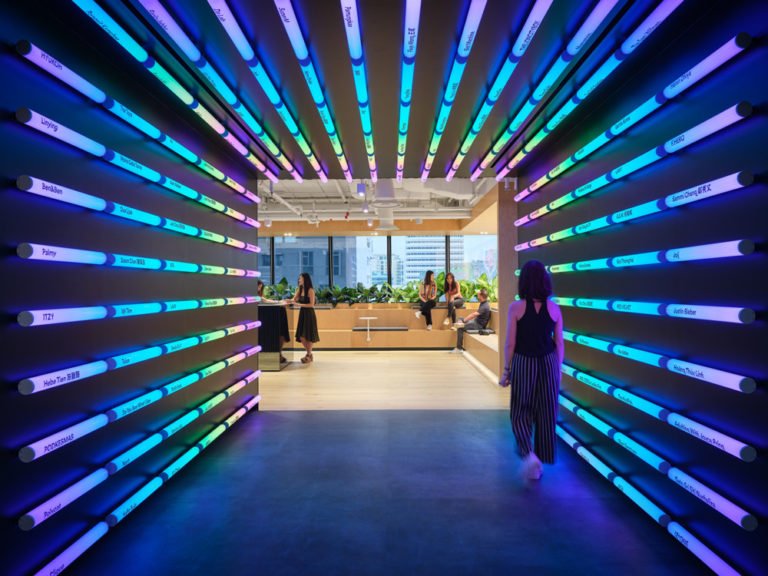
2. Bring in the showroom excitement with Viva Magenta
When it comes to offices or retail spaces, grey and white are the two dominant colours in the industry. They are extensively used in retail to showcase products in a better fashion. To complement the same, Viva Magenta paired with these two colours can create an enticing effect on the break areas and highlight spots of these shopping spaces. Since Viva Magenta is known to be self-expressing and striking, it can be toned down with warm greys and off-whites to create that dazzling yet welcoming space for the users.
This colour of excitement, passion and productivity can even be used on the doors and windows of retail showrooms. This design tactic will not only create a standout effect on the users who pass by the shops but also create more user engagement and buzz amongst people.
Viva Magenta is not just a colour restricted to the furniture or shelves of commercial space, the designers can experiment with it by adding a dash of colour in interior elements such as shapes or textures such as glass, cladding or metals. From fins to the false ceiling to textured glass wall partitions to décor, This colour can surely give an eye-popping look to its users. Always remember, The more attention is paid to these small elements of commercial space, the better the impression on the users.
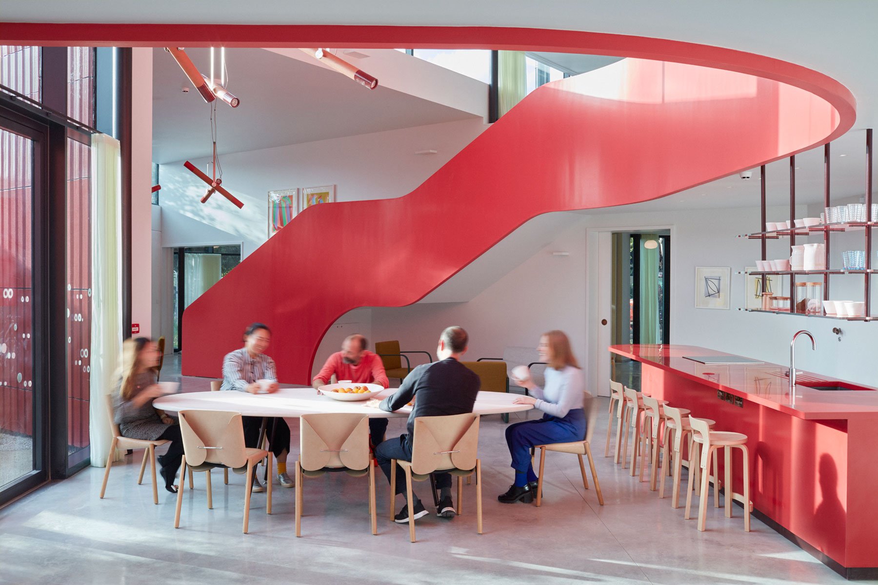
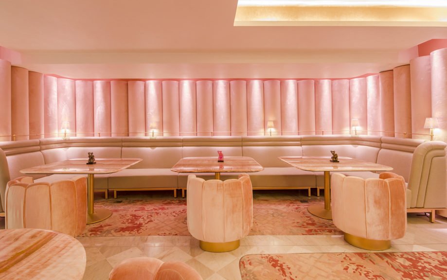
4. Spice up your restaurant interiors with a dash of Viva Magenta
Restaurants are the perfect way of experimenting with Viva Magenta in its interiors. Designers are not supposed to be afraid to dip their restaurant designs in warm tones of lively green plants, and gold and collide them with smooth shiny terrazzo tiles to finish off the restaurant corner. One can add some playful décor such as magenta-coloured seats and table décor to amp up the whole restaurant theme.
To add design depth, restaurants can indulge in soft rugs made of wool and silk. From a table viewer’s perspective, from the salt and pepper shakers on the table to the crockery brought up in front of the guests, these minute details can even play an essential aspect in the marketing of the restaurant. These can also be customised according to the restaurant’s theme of Viva Magenta.
5. Cheer up the patients with Viva Magenta
Hospitals and healing centres tend to be restricted to greens and white tones, But a little Viva Magenta-toned break area most certainly would not affect the whole healing process. Therefore, Viva Magenta is not just a colour to amplify commercial offices but can also be utilised more smartly in healthcare.
Designers and architects can incorporate unique purple tones in areas where the users can feel cheerful and lively. Initiating colours in hospitality designs not only lifts the patient’s mood but also creates a psychological power to hearten the users. This aura affects the user’s mood and provides a nice break from the whites they view all day long. On the other hand, Waiting rooms and coffee areas can also be spotted with these magenta nooks, making the users powerful and energetic.
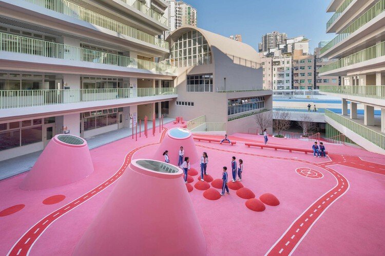
6. Magic of Viva Magenta in making an educational stand out
Architecturally, educational institutes and school premises are usually focused on plain white elements other than aesthetics and colours. For these categories, the designers can spruce up these educational spaces with fuschia, magentas and bright pinks, reviving the student’s moods. The colourful paintwork and corners create inspiring learning areas for the users. For primary schools, children can also indulge in play areas dipped in pink and magenta. Designers can even provide all-white classrooms with Viva Magenta desks and educational boards which can run as a conceptual theme throughout the entire school. For sports and outdoor breaks, magenta can subtly be incorporated with warm white and reds for a more contrasting effect.