
Impact Acoustic
Primary Play


Overview
- Collection
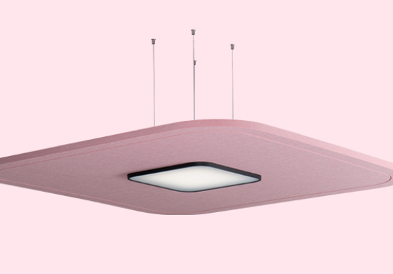
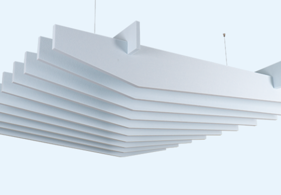
- ARCHISONIC®
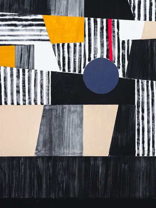
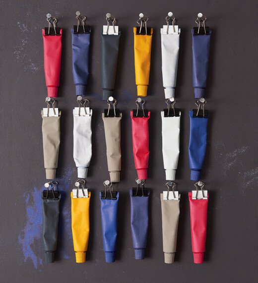
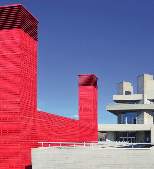
The Bauhaus centenary has reawakened designers’ interest in primary colours and the fundamental building blocks of colour are here in this nuanced red, blue and yellow.
Their beauty lies in their simplicity, and in combination with their childhood familiarity, the addition of almost black and white brings a cool graphic touch.
While corporate branding and commercial space zoning are natural outcomes for individual primary brights, we see directional applications increasing in importance.
The primary story happens when all three main colours are used together, with varied proportions creating differing moods. As with the Energetic Brights palette, combine with coordinating coloured textiles and solid surfaces.
Resources for Designers
- PRODUCT WEBSITE :
- View product website
This Product is from ARCHISONIC® and goes very well with Products from the same collection