
OBJECT CARPET
COLOR OPINIONS


Overview
- Type
- Broadloom
- Designed by
- zukunftStil
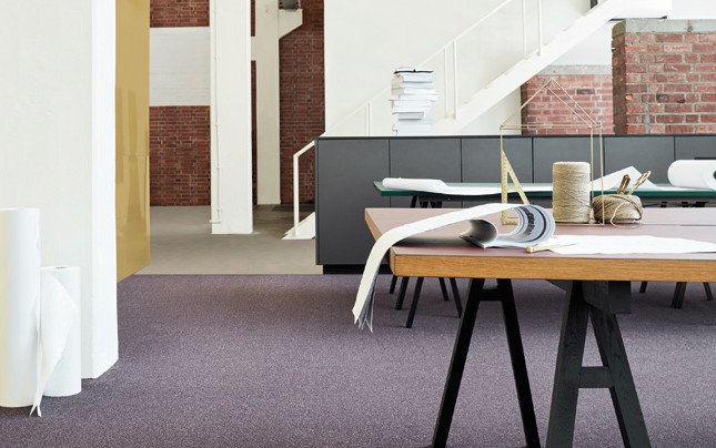
Think in colors – influence the atmosphere of a room. The new COLOR OPINIONS Trend Collection tells the story behind current trend developments and new perspectives in interior design. Different worlds of color and style with a range of material combinations inspire to creative interior concepts with outstanding results.
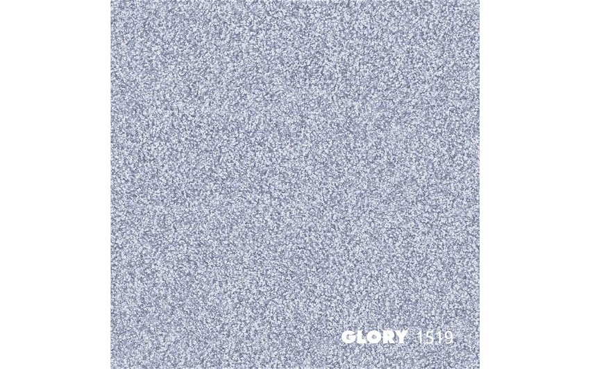
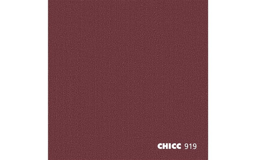
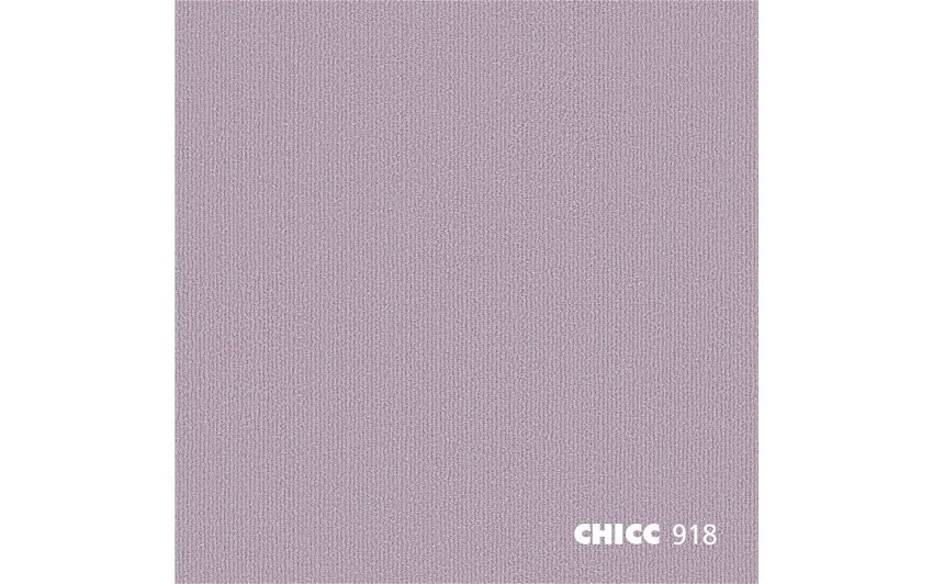
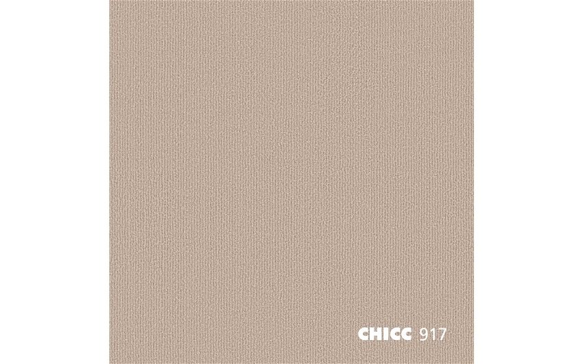
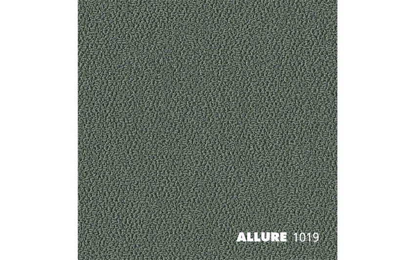
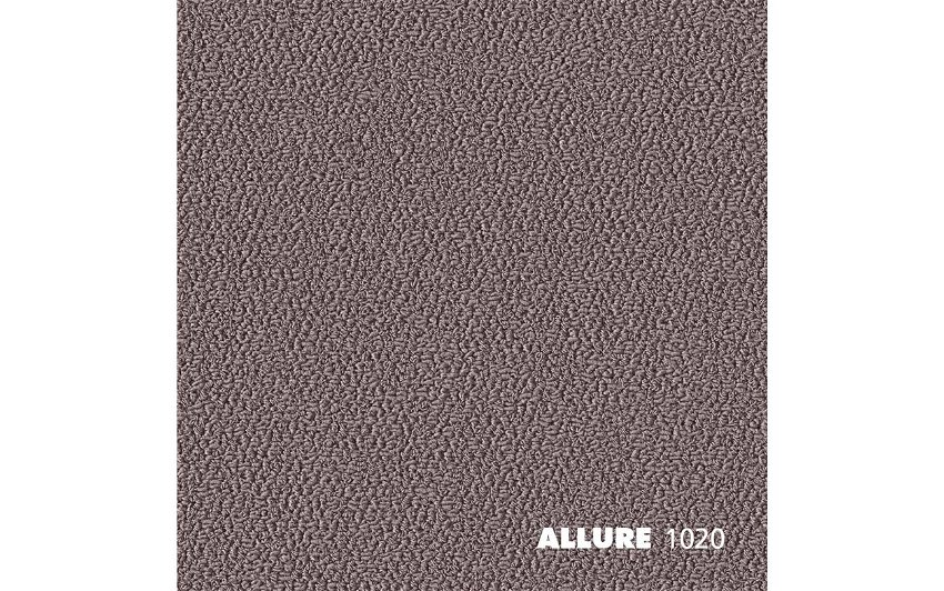
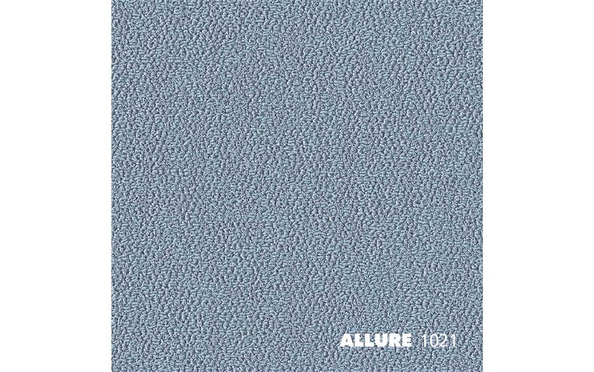
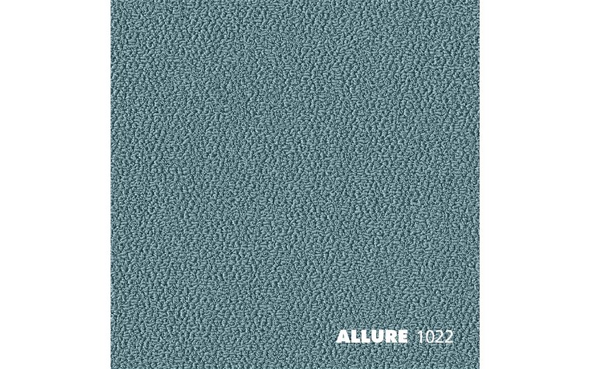
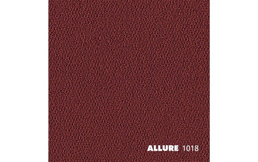
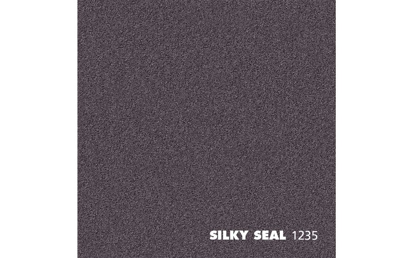
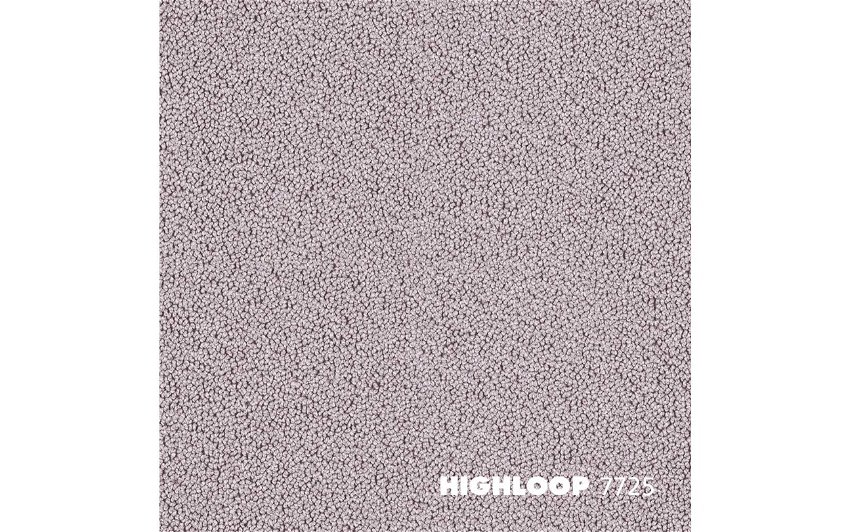
COLOR OPINIONS by zukunftStil was created as a trend collection in cooperation with and for OBJECT CARPET. The COLOR OPINIONS Trend Collection is made up of three different trend worlds, each describes a unique room design concept. Each style has 16 colors, which can be combined with each other in any configuration; interior designers can use these to develop creative design concepts for office, hotel, living and retail spaces. All trend colors are available as broadloom and RUGX, and many of them even as Acoustic Tiles.
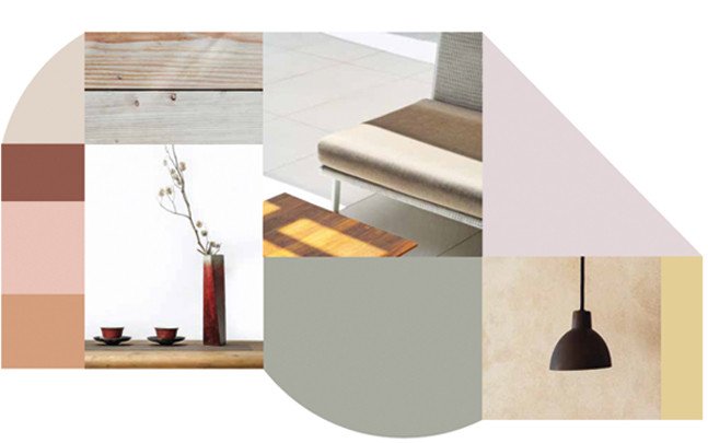
NATURAL CONTRAST
AUTHENTIC · HARMONIOUS · TEXTURED
Natural style and influences from a range of cultures come together to create a crystal clear design concept with contrasting accents that draw inspiration from around the world. Traditional elements from Japan, Africa and Scandinavia provide authentic, relaxed comfort with an international feel. The room feels open and fresh, creating an energizing atmosphere that delights the senses.
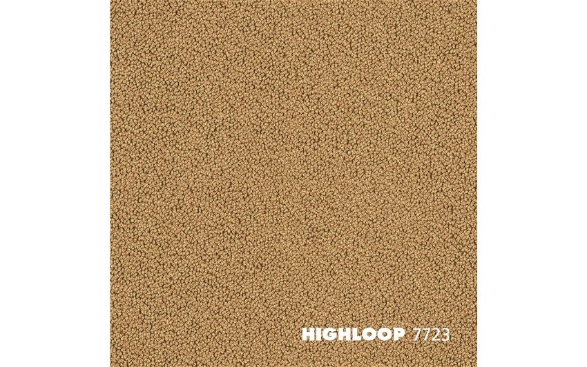
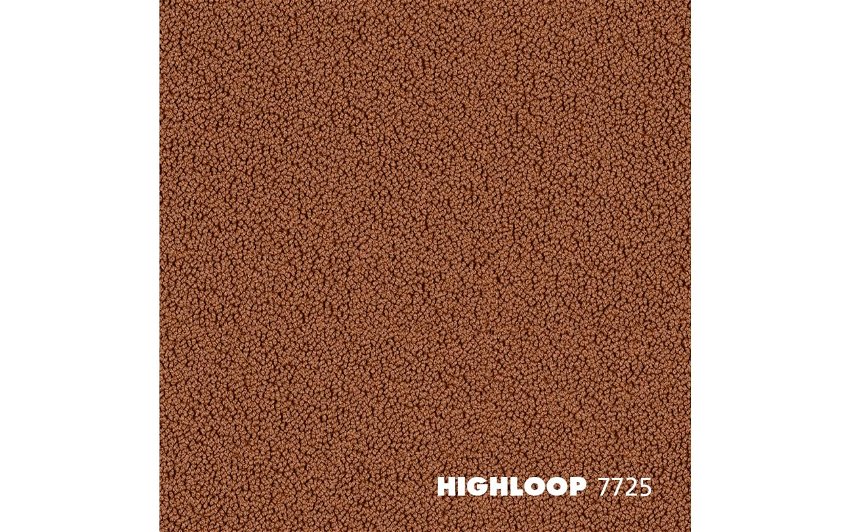
Color palette: lilac, cream, pink, nude tones, soft yellow, mint green, brick red
Materials: textile, wood, plaster surfaces, rattan, braids, wool
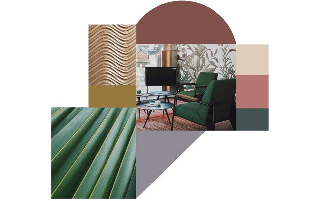
INTENSIVE GRACE
VELVETY · CHARMING · EXPRESSIVE
Dark colors and intense, stylish maximalism create a brand new form of luxury and opulence. A trio of styles – Art déco, art nouveau and baroque – converge to create a soothing environment with a hint of mystery, thanks to a combination of geometric splendor and laid-back elegance.
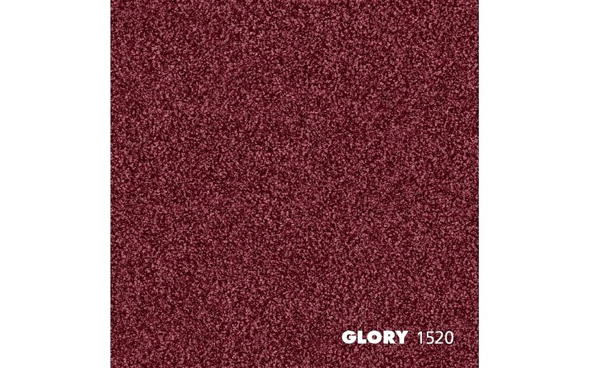
Color palette: berry tones, brown, rouge, cashmere, petrol, dark blue
Materials: textile, velvet, marble, terrazzo, colored glass, brass
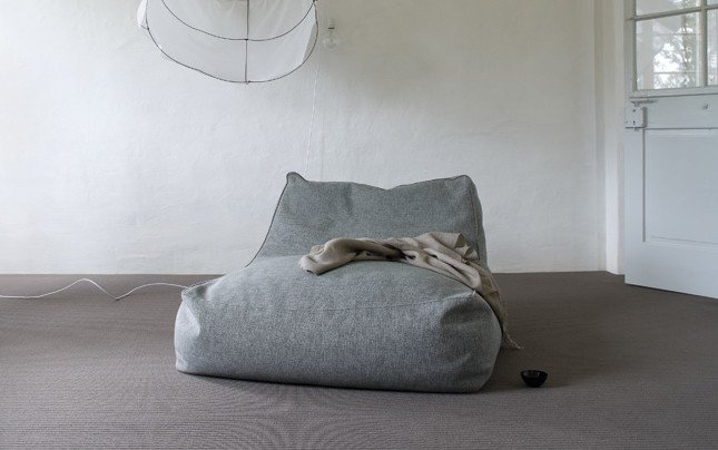
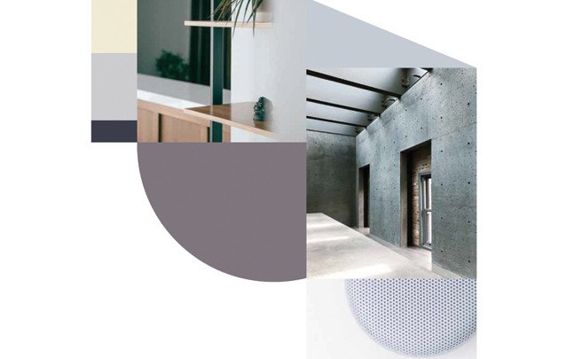
SOFT MINIMALISM
SMART · CLEAR · REDUCED
Delicate, muted pastel colors and a simple, pared-back design create a connection between people and the digital world. A calming aesthetic accompanies digital deceleration and illustrates a simultaneous need for interaction and relaxation. These layers interact in the room to create a weightless, all-encompassing spaciousness.
Color palette: light blue, colored gray tones, black, violet, soft olive
Materials: textile, granite, marble, grayed wood, linen, concrete