
OBJECT CARPET: How Colour Reflects the Spirit of The Times
An interview with the colour specialists at the trend agency zukunftStil
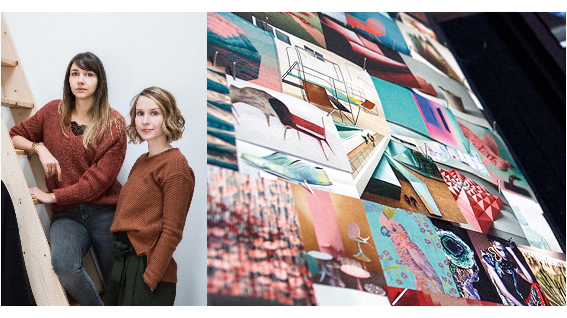
An inspiring interplay of colour and texture: With COLOR OPINIONS, OBJECT CARPET has created an extraordinary trend collection for floor design that perfectly captures the modern zeitgeist. In an interview, Livia Baum and Jutta Werner, the trend agency’s colour specialists, share their insights into researching colour trends – and what these tell us about our society.
- What was your method for researching trends and developing the COLOR OPINIONS?
The process of trend research consists of various steps. It starts with scouting, where we observe the market, research and collect data. That could be images in magazines or photos from trade fairs and events. In the end, we often come up with more than 5000 images.
The next step is to create a trend panel centred on the main question: Where is the market heading? We observe and discuss with other experts, group together and link image data and information. For OBJECT CARPET, there was a very specific trend panel where we consciously looked at which developments there are in the flooring and carpeting field. This gave rise to trend worlds, which we subsequently refined into specific codes. We represent the characteristics of a trend with codes that indicate significance. What colours are there? Which materials and surfaces are important? This plays a key role in developing a collection.
- Which colour trends were you able to identify and what do these tell us about society and the current mood of the times?
We defined a total of three trends for the coming years. Each one clearly focuses on people and well-being. You could say that there are two poles: on the one hand, there is the slow culture, which includes mindfulness and deceleration. Safety also plays an increasingly important role and this is reflected in natural, soft colour arrangements. The polar opposite is the speed of the digital age, which we are exposed to every day. But even the digital and technical spheres are becoming less abstract and progressively more approachable and human, which is reflected in their colour schemes. The third trend represents a great longing for optimism. We’re looking forward to the time after the pandemic and to a light-hearted mood. This new enjoyment of life is mirrored by intense and bright tones. Especially in combination with the soft and natural colours, this is an interesting and beautiful development.
- The three new style worlds are NATURAL CONTRAST, INTENSIVE GRACE and SOFT MINIMALISM. What are the characteristics of each of these?
NATURAL CONTRAST intentionally focuses on themes in nature and culture. The core values are authenticity and humaneness. SOFT MINIMALISM combines deceleration with digitality, which is expressed by soothing colours and soft chalk tones. INTENSIVE GRACE is a striking reinterpretation of Baroque, Art Nouveau and Art Deco elements. We also like to speak of an elegant maximalism that consists of dark, high-grade colours, which create a feeling of being sheltered while also developing their own unique charm with innovative and fresh colour accents.
- We already know some of the trends, such as the return of warm, soft colours, from the 1970s and 1990s. Why do some things come back and how are these trends still given a modern touch?
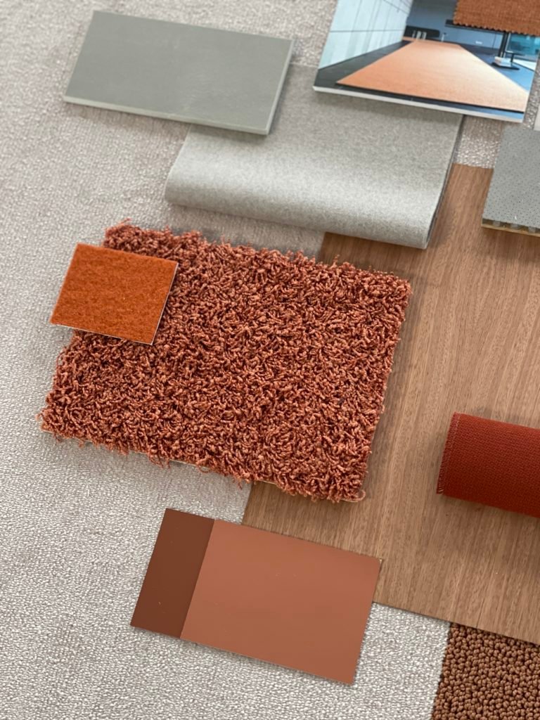
In the 1970s, the oil crisis really made people aware of the sustainability issue for the first time. Even then, there was a change in how we approached natural materials such as wood in inside spaces. Natural shades like brown and green hues became more popular. Today we’re going through this development again, because the topic of sustainability is growing in importance and can no longer be neglected in interior design. Colour is also a mirror of society, so it’s no wonder that some of the trends are returning. However there are still differences, for example due to changes in materials and application areas. The classic terracotta colour in the 1990s was associated with a Mediterranean style and had the character of a country house. Today, however, terra is presented in a completely different style and often used in a product and technical setting. Exactly the same colour from the past is now often applied with a new, high-quality finish. This is how the design language evolves, achieving a completely new effect in its appearance.
- Do the trends differ according to the cultural context or should the developments be seen on a global level?
We see globalisation as a megatrend: it has become very apparent that colour preferences have merged a great deal on an international level. Trend panels in Colombia, for example, show trends similar to those we are also seeing here, and this although we are on a completely different continent. Of course there are always certain cultural differences. Those are visual habits and taste patterns that have regional variations to some degree. In the north, puristic and functional colours tend to dominate because we learned that we feel comfortable in these colours. In the south, however, it can be a little warmer and bolder. In some styles, such as the trend towards maximalism, you can see that cultures can also mix in very appealing ways. The Japandi trend is another example where this works well.
- Can you predict colour trends to a certain degree and if so, what do you forecast for the next few years? In your work on COLOR OPINIONS, were there also things that surprised you?
We have watched the market for about 15 years, in turn gaining crucial empirical values. With continuous observation and regular trend panels, you’re able to make a good assessment of the market. This means that the trends of the next 3 to 5 years can be predicted quite reliably, including when a certain trend has reached its peak. You can see exactly when something new appears, gains volume and then gradually disappears again. Pink was a trend colour that slowly picked up speed ten years ago and then developed great popularity and acceptance with a peak 3-5 years ago. Now the colour has become engrained in our visual habits and almost evolved into a timeless colour that accompanies various designs with subtle nuances. We can also develop longer-term scenarios for the next 5-20 years in the area of futurology. We also like to say: Only those who know the past can properly assess the present and anticipate the future.
- Which special aspects does carpet offer as a medium?
Carpet occupies a very large area in the room, which means that not every colour works in every room. This is important to note and is related to our need for safety. When it comes to feeling comfortable, haptics also play a major role. It’s becoming increasingly important for things to also feel nice. In this regard, the floor design has a huge emotional impact on our experience.
- The product range of OBJECT CARPET offers a particularly broad spectrum of colour and material worlds. Did this diversity influence the collection?
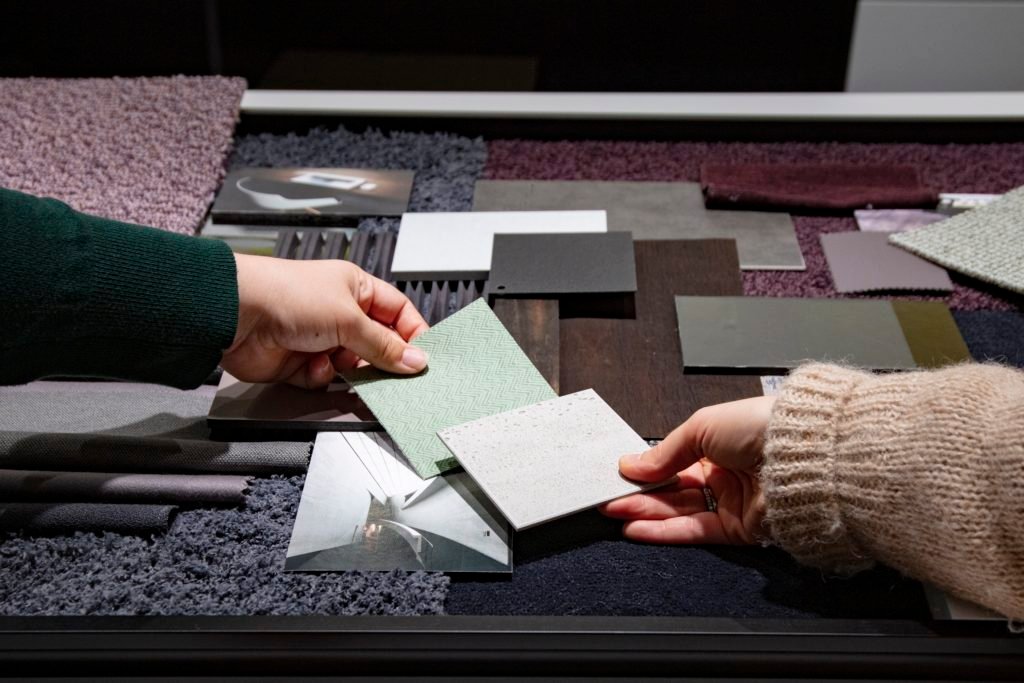
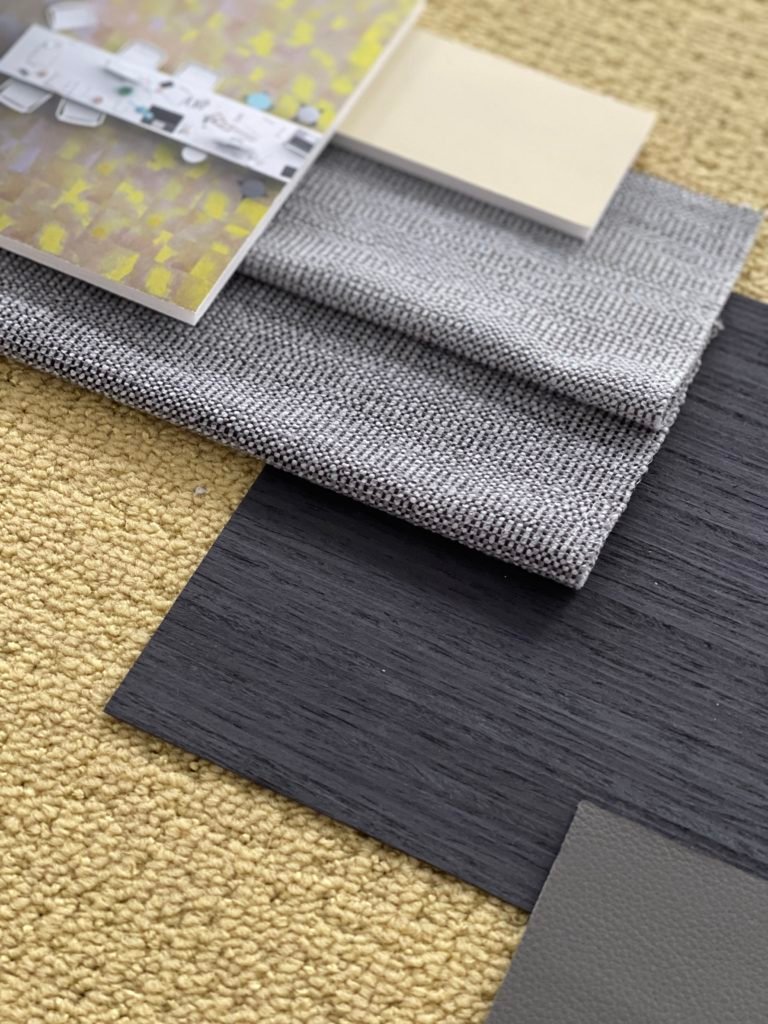
Of course the huge colour diversity offered by OBJECT CARPET was a huge advantage in the development of COLOR OPINIONS. With over 1000 styles and colour shades, it was possible to see great combination options for colours and structures that perfectly express the various trends. As a result, each trend world also has its unique material language: NATURAL CONTRAST is woolly and matt, SOFT MINIMALISM offers an exciting mix of shiny and matt styles with a low pile height, while INTENSIVE GRACE is glossy and high-pile. This trend collection is a beautiful mix of existing and new, specifically developed colours. We also developed a tool for consultants and designers with the new design fan, making it easy to find your way through this abundance of options. We asked ourselves, what is the simplest way to show the combinations from the individual style worlds which look particularly good? With this convenient tool, we provide users with recipes that impressively represent the combination of colour and materiality in a room and offer over 100 options for inspiration.
About OBJECT CARPET
Since 1972, OBJECT CARPET has stood for quality, design and innovation in the commercial property sector. A sense of aesthetics and colour, in combination with advanced production techniques, results in high-grade and extraordinary designs in the form of broadloom, carpet tiles and custom-cut carpets (RUGX). With over 1,000 styles and colours as well as individually-customised products, the OBJECT CARPET collection offers a unique diversity for modern interior design, manufactured from high-quality raw materials.