About the project
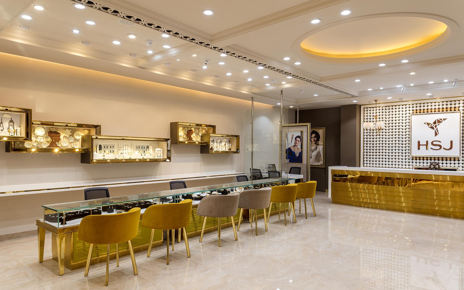
Located in the heart of the historic city of Lucknow, HSJ is an age-old jewellery brand that exudes grandeur. Delhi-based architectural practice, RMDK, in collaboration with I’m The Centre for Applied Arts, created a home for their dazzling designs with a retail experience that would appeal to a wide range of audience. The store is spread over 10,000 square feet, and covers two levels. The ground level is demarcated for gold and the upper level for diamond and silver products.
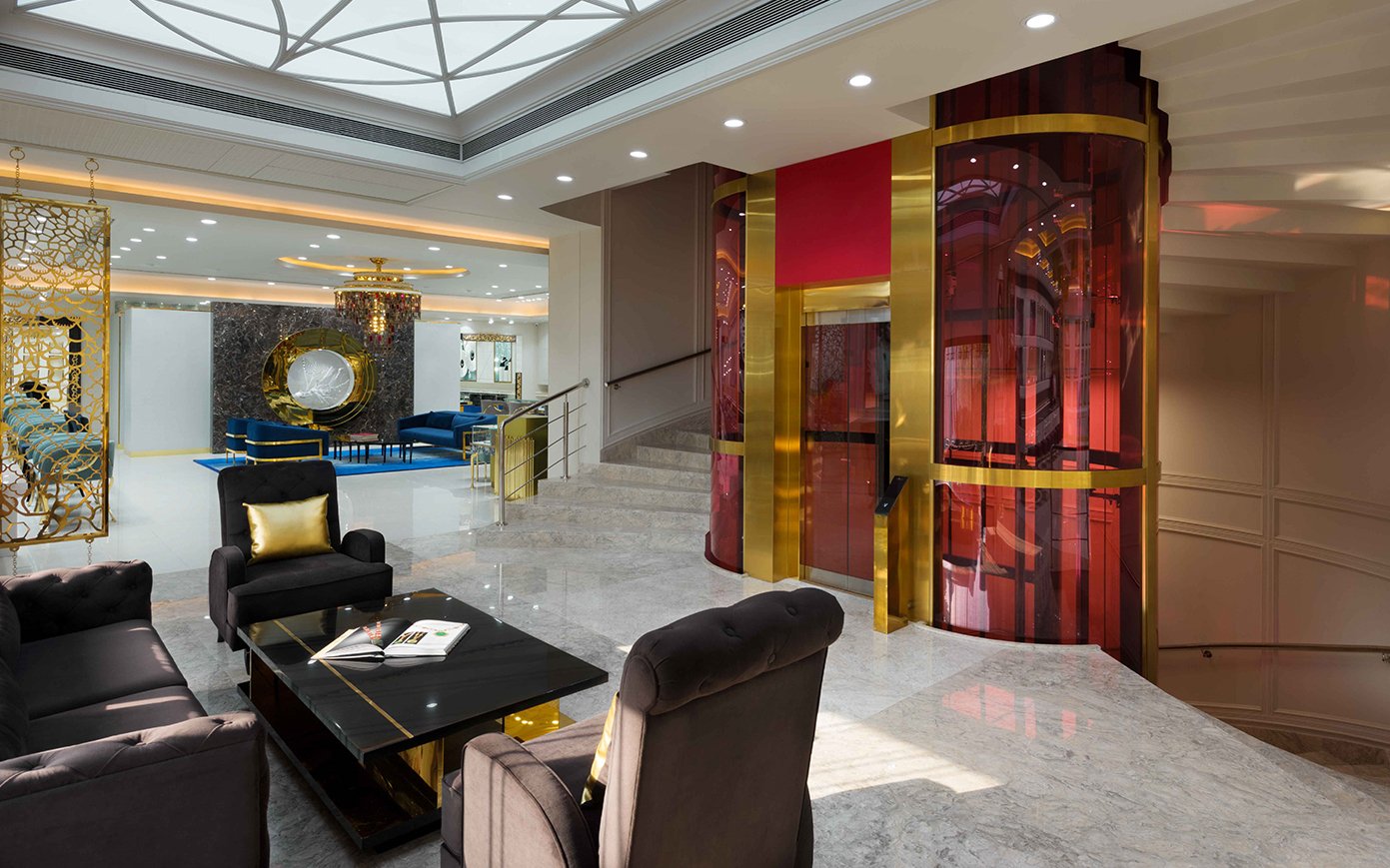
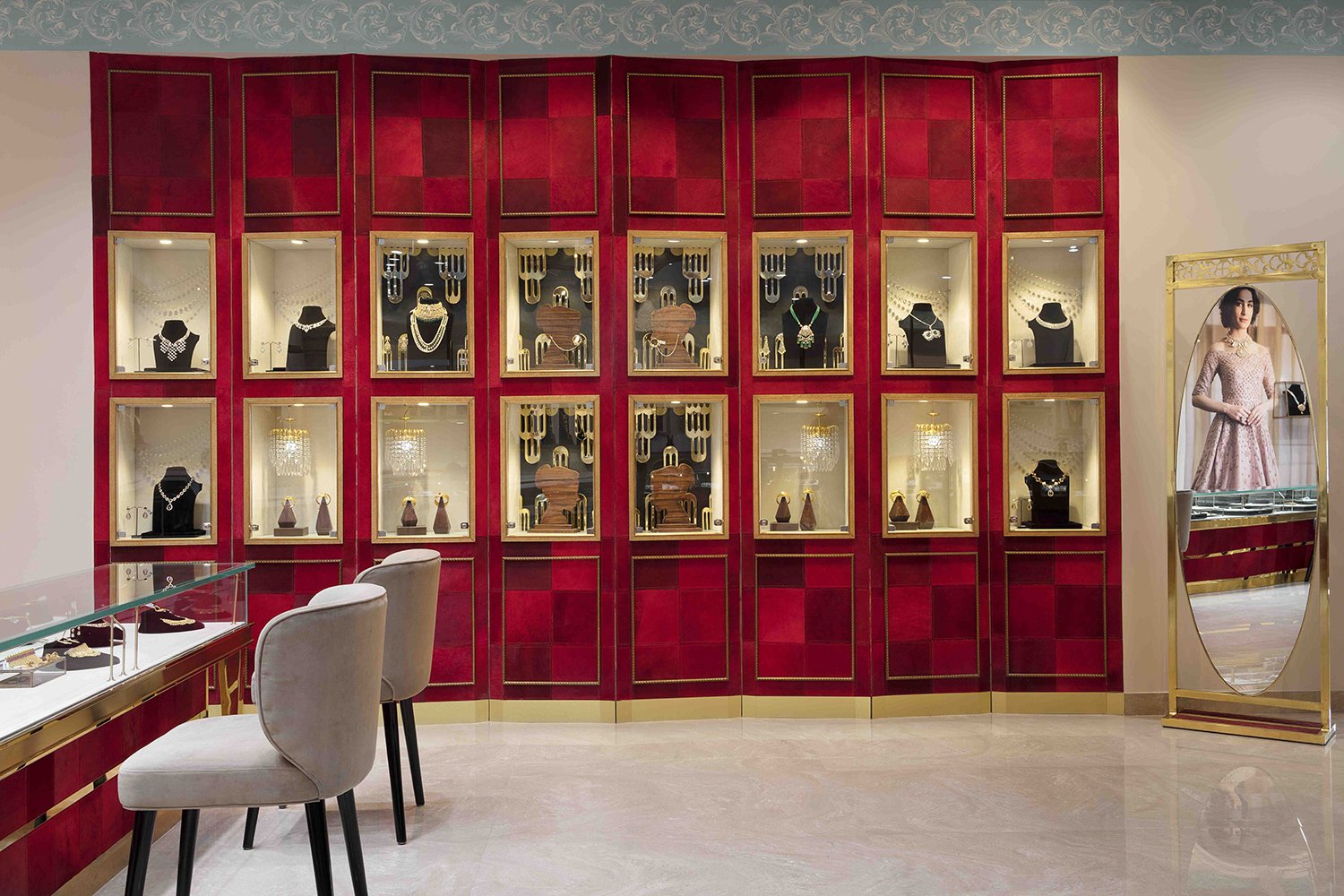
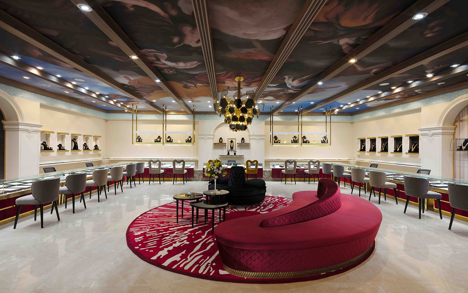
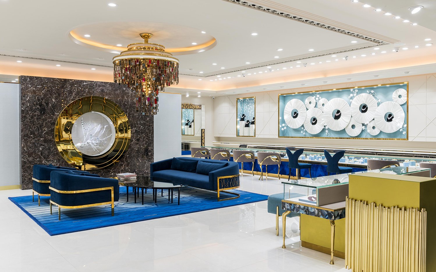
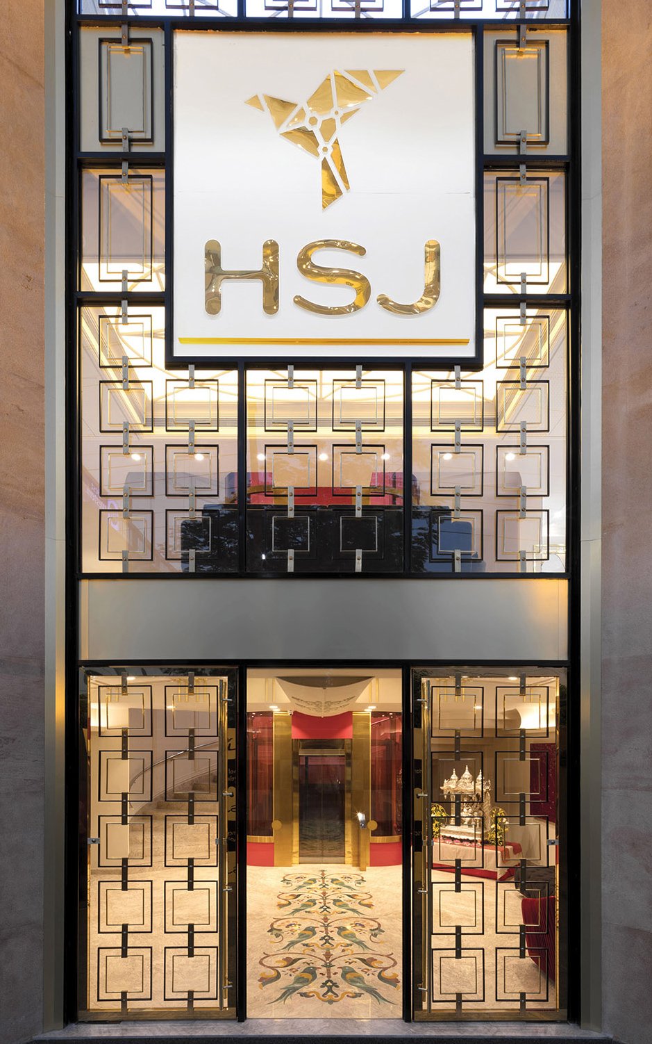
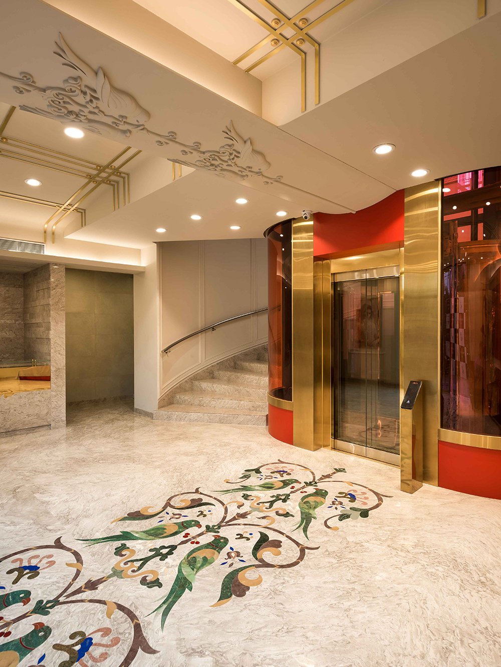
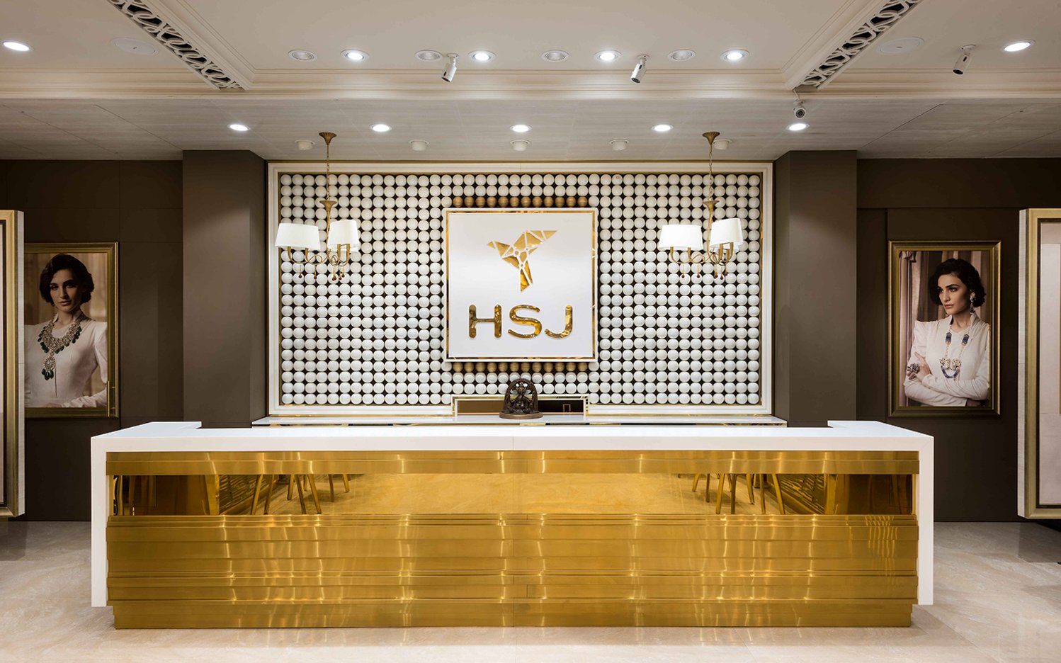
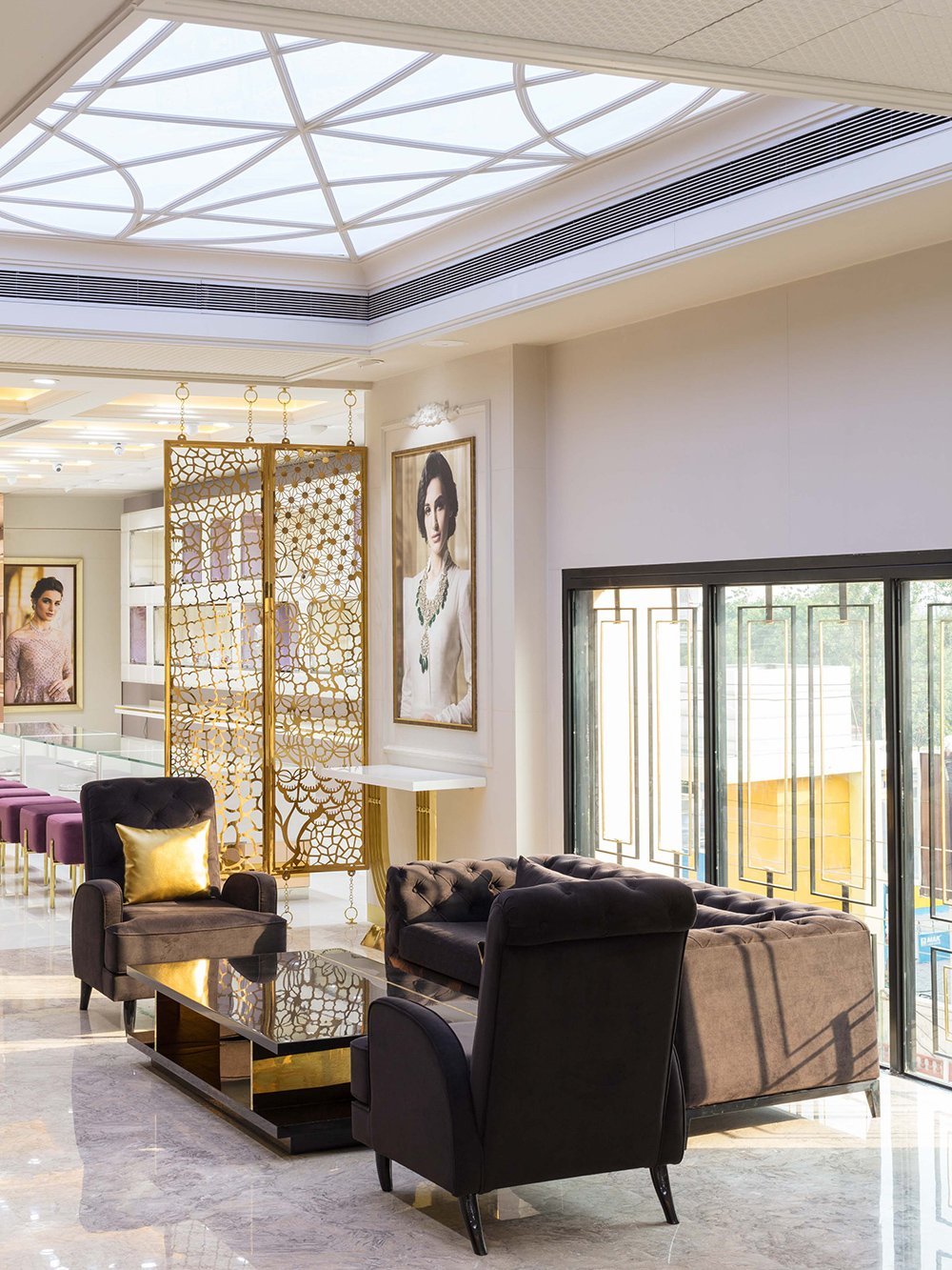
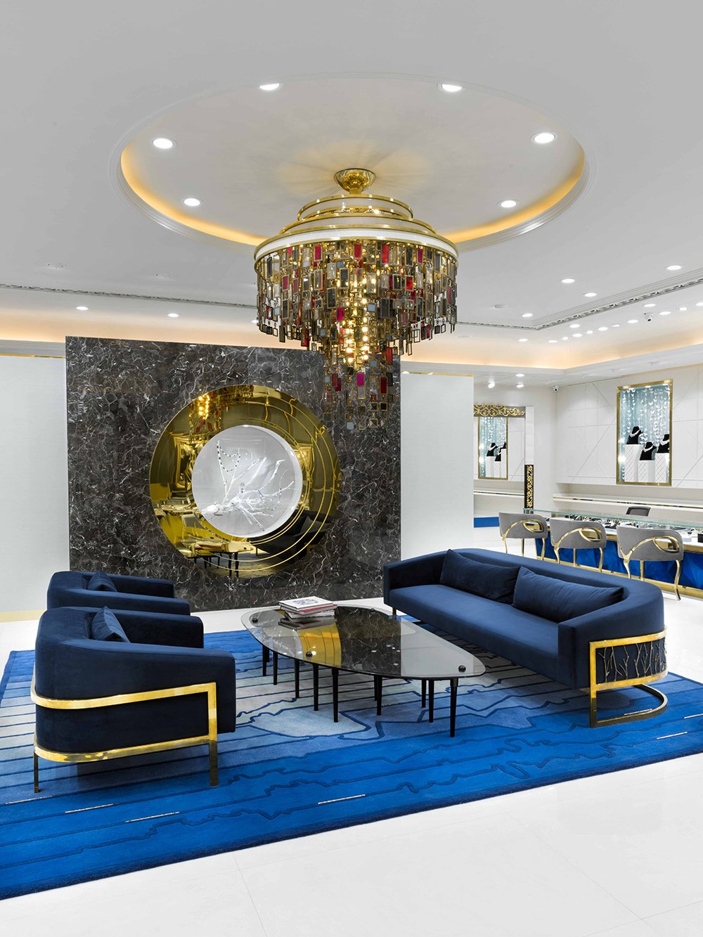
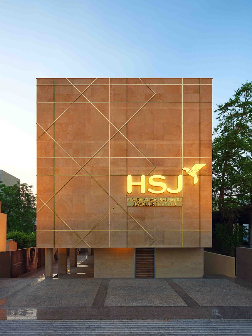
Built as an introverted vault, the solid sandstone façade makes a bold statement with elegant surface detailing in gold steel. The entrance is marked by a delicately detailed, 30 foot high glass door, which opens into a reception area with a customised, elliptical, red glass elevator wrapped by a spiral staircase, forming an iconic centerpiece. The path to the elevator features colourful floor inlays, inspired by traditional Meenakari craft that is replicated on the roof, reflecting the brand’s eclectic design style. The elevator opens into a lobby area on every floor with an illuminated ceiling installation, seen through the main entrance, creating a strong visual element of intrigue. Every element in this retail space is detailed as a jewelry piece. Each display section has been designed according to the product range. These individualistic display systems ensure each jewel stands out while getting its own space to celebrate the craftsmanship of the deluxe products. The plush furniture and the chandeliers have been detailed to look like installations that reflect the essence of the exhibits. Even the lighting spectrum is customised to enhance the product range in respective zones.
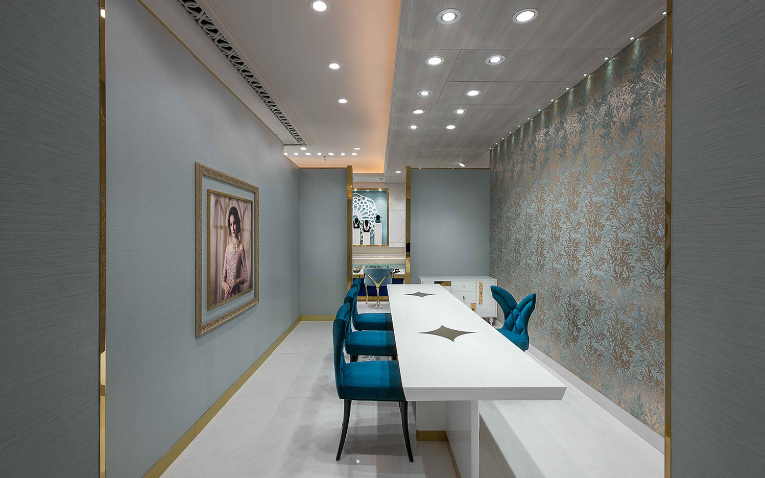
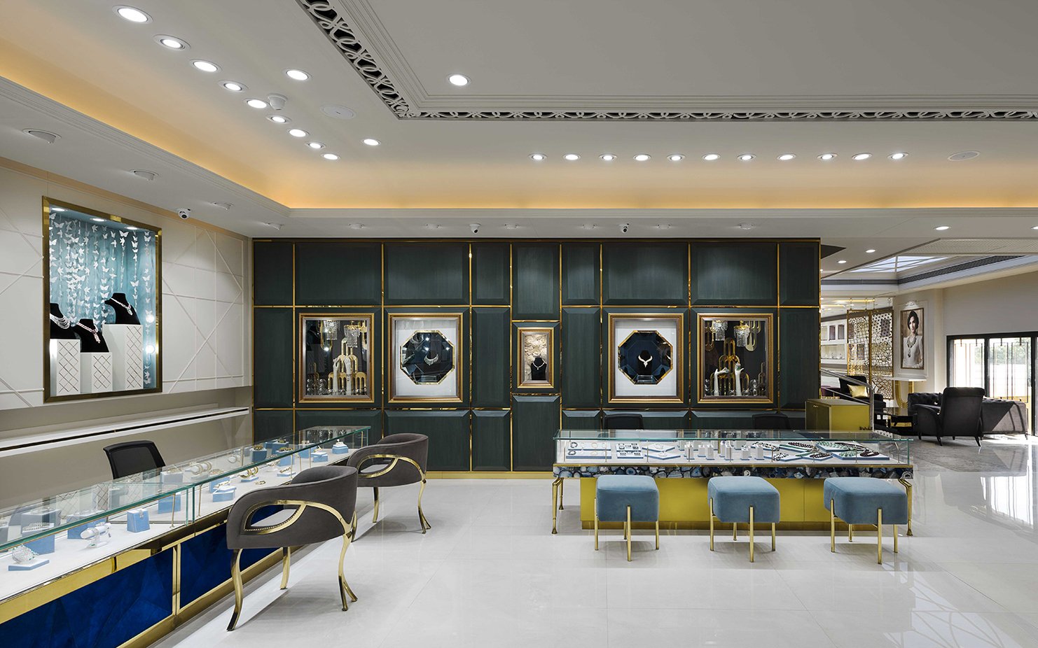
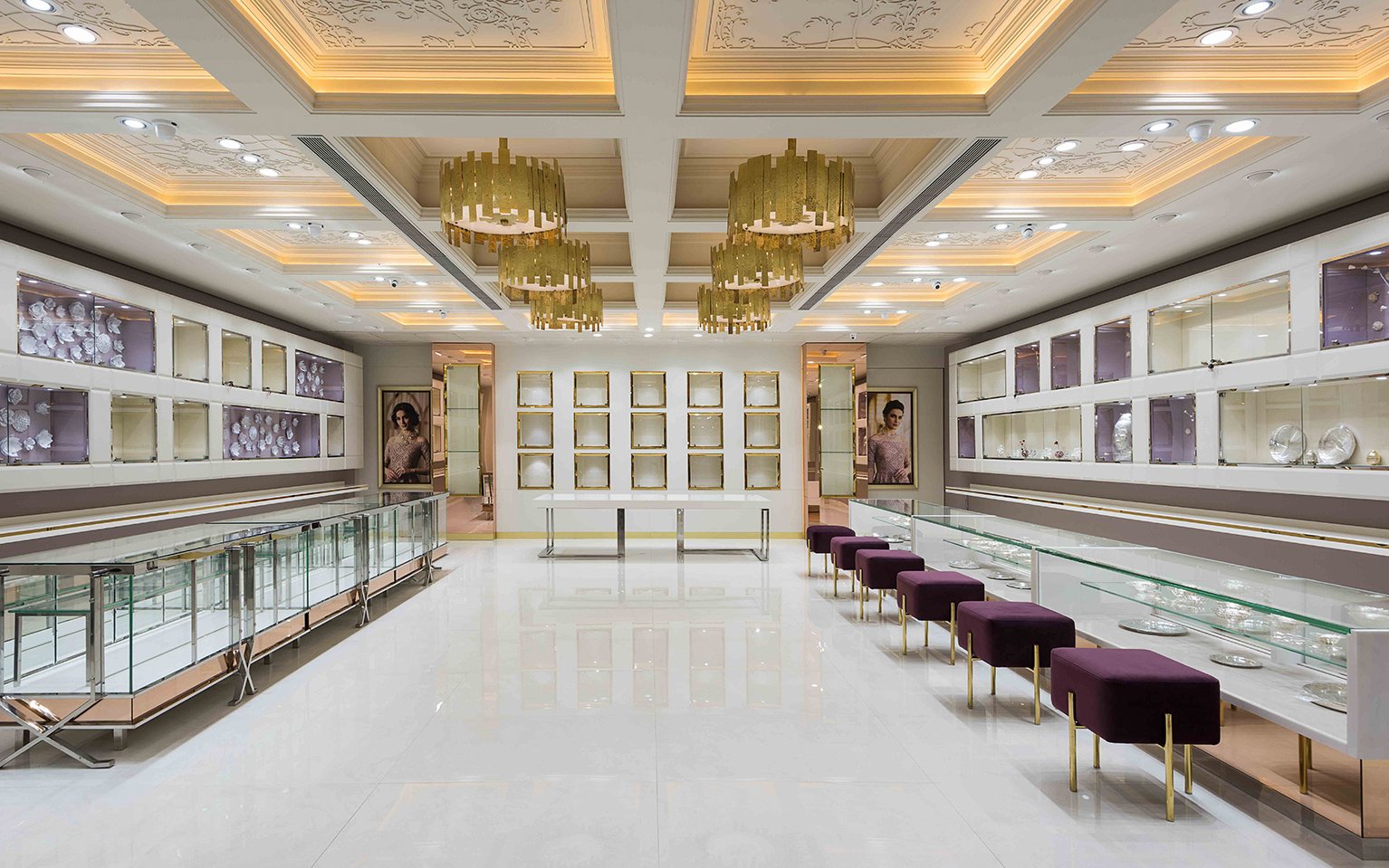
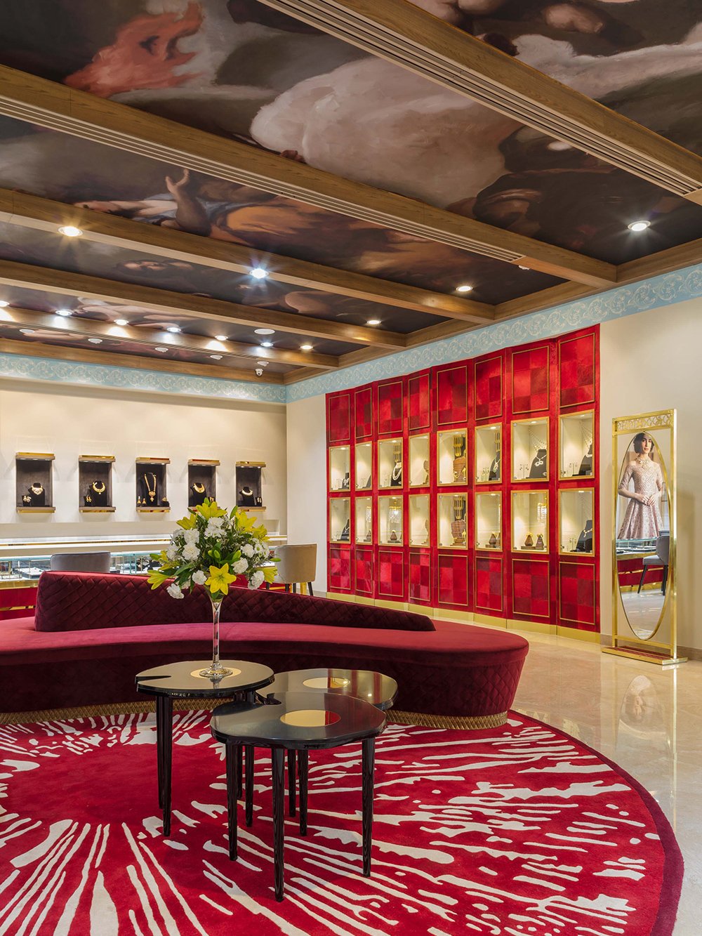
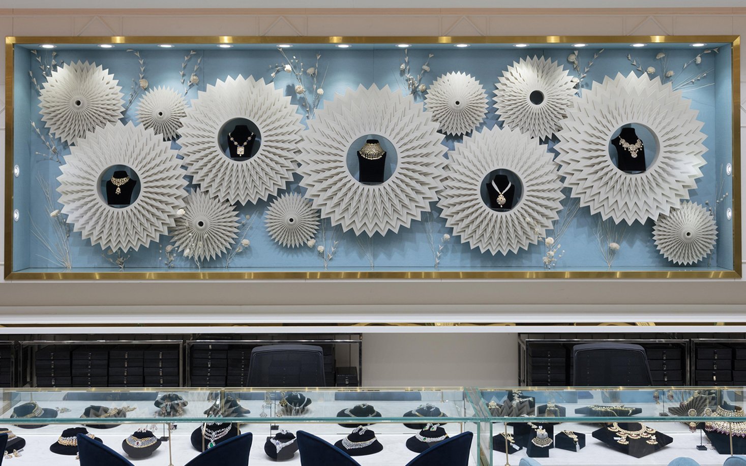
In the boutique gold section, hues of red dominate the palettte, and a hand-painted ceiling lends a theatrical touch. Each ornate display frame is designed to look like a maestro’s painting. The daily wear gold section follows a simpler colour scheme of white and gold, with the reception feature wall inspired by pearls, while the diamond section is designed in shades of blue. The semi-precious stone counters along, with the bull’s eye arch display and white origami floral displays, convert each product into a statement installation. In the silver section, minimal interiors balance out the mass and chunkiness of silverware.
Products Featured

Project info
Client:
Industry:
Size:
Address:
Country:
City:
Completed On:
Community
Interior Designers:
Fit-Out Contractors:
Photographers:
Tags: