
About the project
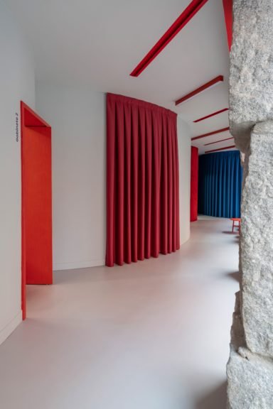
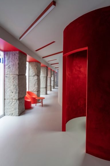
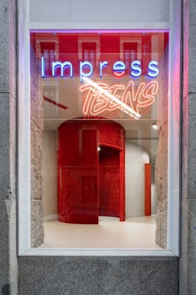
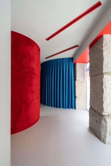
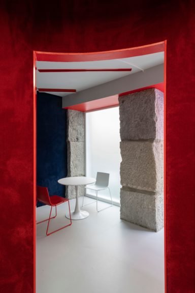
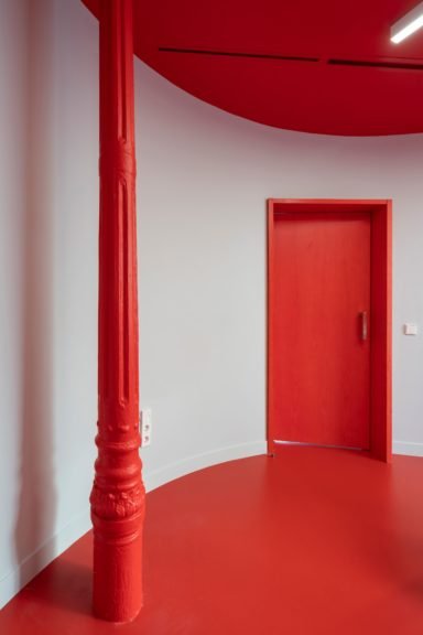
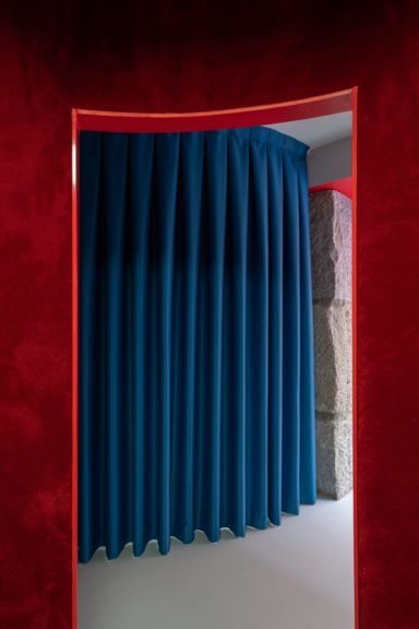
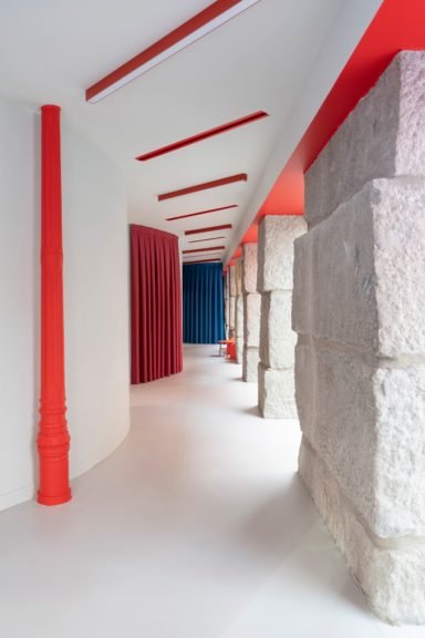
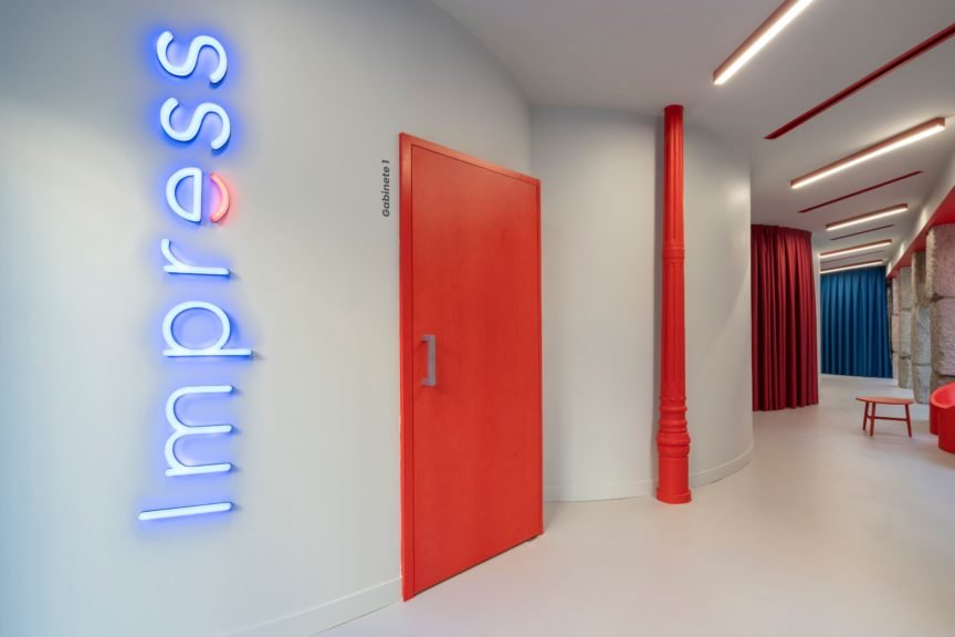
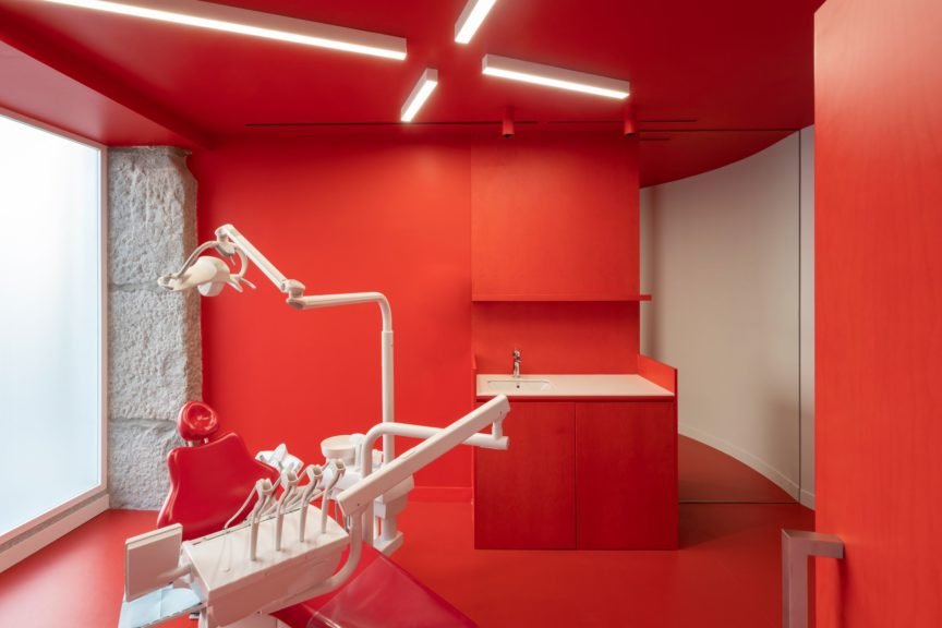
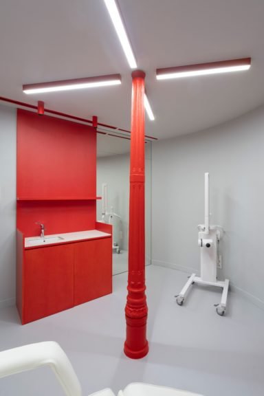
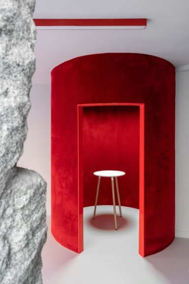
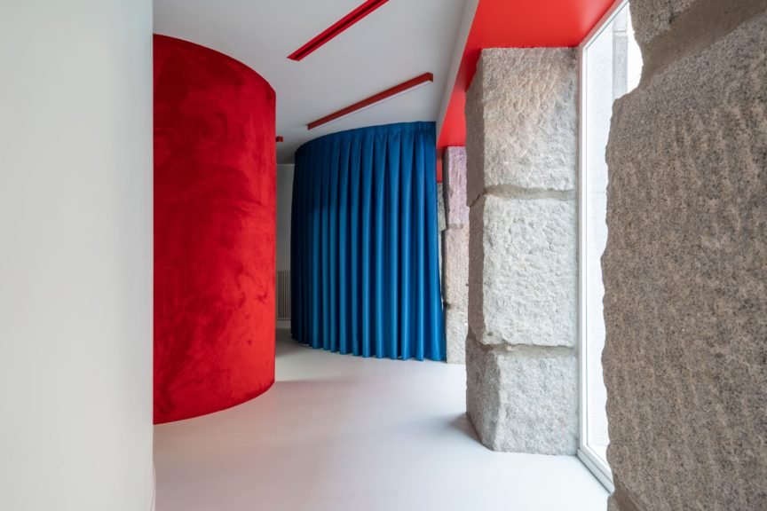
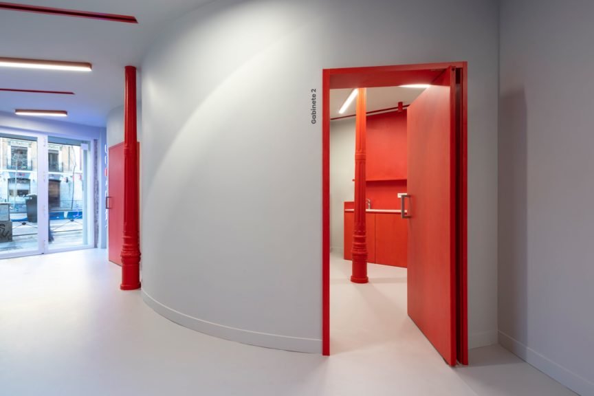
This new clinic for Impress in Madrid is located on a busy corner of Carranza street, where a line of huge granite ashlars delimits the perimeter towards the street, while inside, slender and refined wrought iron columns make the counterpoint to the ashlars. This striking contrast between these two porticoes guided the design process: a series of curves in the form of cylinders crowd the interior party wall and play with the wrought iron columns, leaving them inside or outside them, while leaving an empty space towards the stone ashlars, where the lobby and the waiting area are resolved, always in close contact with the street. In this way, a dialectic game is created between the enormous stone pillars, which are given space to be seen, and the curves and iron pillars, which appear, in contrast, as fragile planes and lines that approach and move away from the ashlars. Even the iron columns themselves have been painted red, giving them a more playful character compared to the stony seriousness of the granite.
The use of curves is a recurring design element in the projects we carry out for Impress, based on its own logo, and functionally, it has been revealed as an optimizer of spaces on small footprints. Thus, all public rooms are resolved by concatenated cylinders, varying their size according to need; in turn, the space in negative, towards the lobby, achieves a very rich and complex spatial quality, with an ever-changing perimeter, flooded with natural light. For the rest, all the private functions of the clinic are solved in the basement.
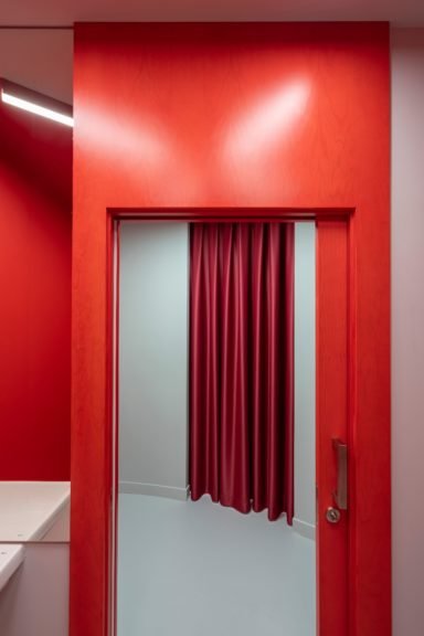
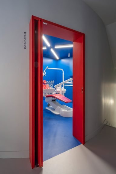
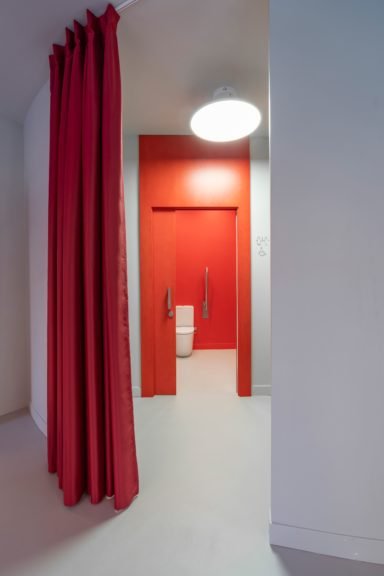
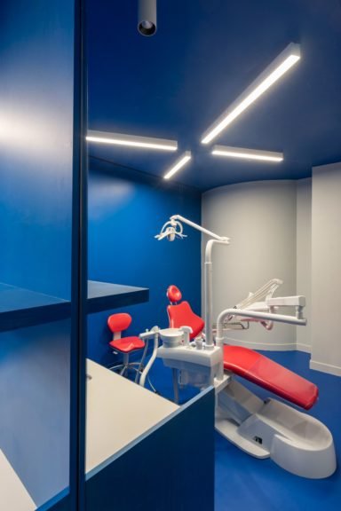
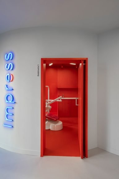
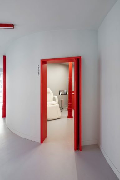
The hall/waiting area, developed longitudinally in close contact with the outside, is stained gray, both on the linoleum floor and on the lacquered walls, where the ashlars, clearly outlined by a red soffit, stand out for their massiveness. The doors, blocks of wood tinted red, announce the passage to other rooms, where the color codes change in each one of them. Thus, the three corporate colors of Impress, red, gray and blue, star in each of the three boxes, applied indistinctly.
All these spatial, material and figurative resources are due to the communication of the Impress brand, aimed at a young audience, and allegedly far from the traditional concept of a dental clinic, while pursuing a design that encompasses not only visual conditions, but also tactile and sensory ones, where the reference to David Lynch’s ‘Twin Peaks’ universe inevitably reappears.
Products Featured

Project info
Client:
Industry:
Size:
Address:
Country:
Completed On:
Community
Architects: